Special thanks to Juan Camilo Villa &
Tony Lee for their collaboration and support.
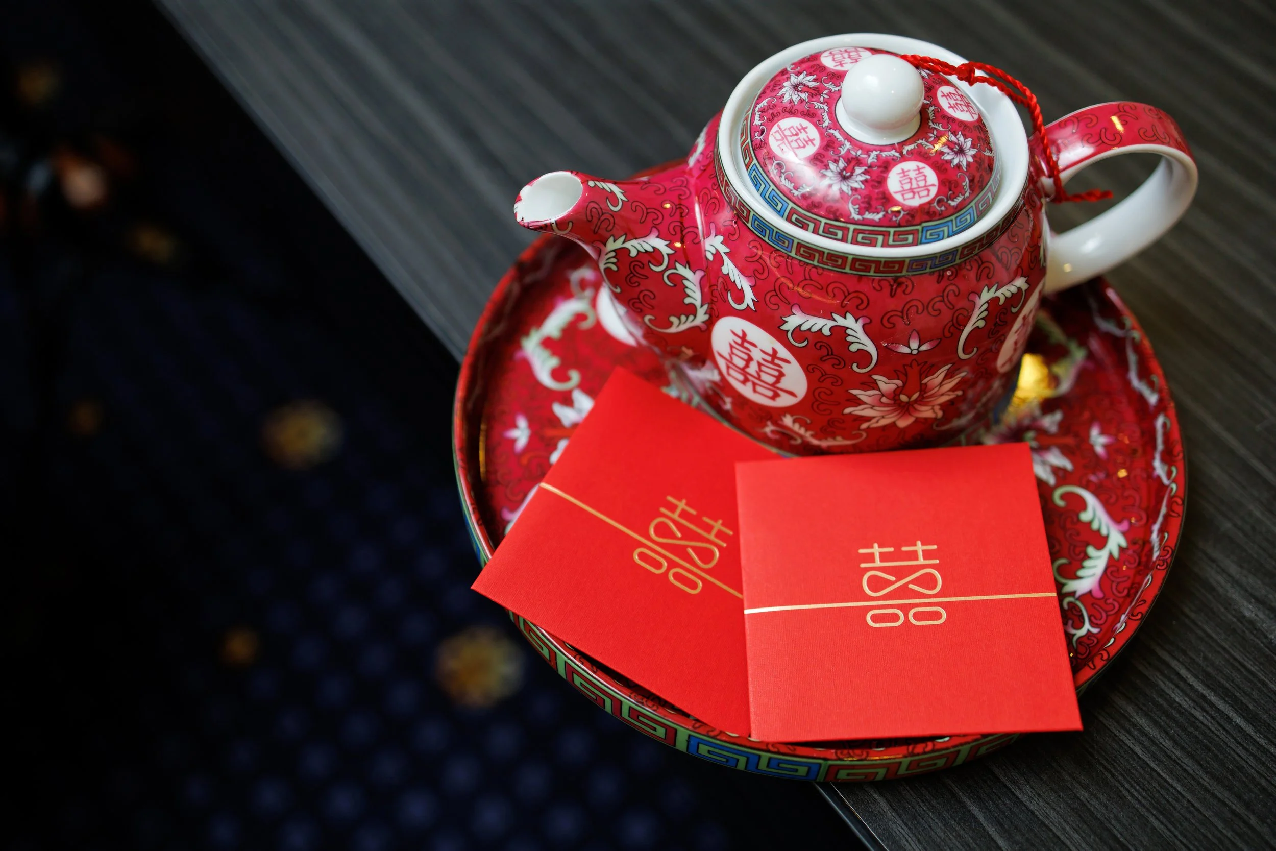
The Teapot
Logo Redesign
Tradition meets modernity
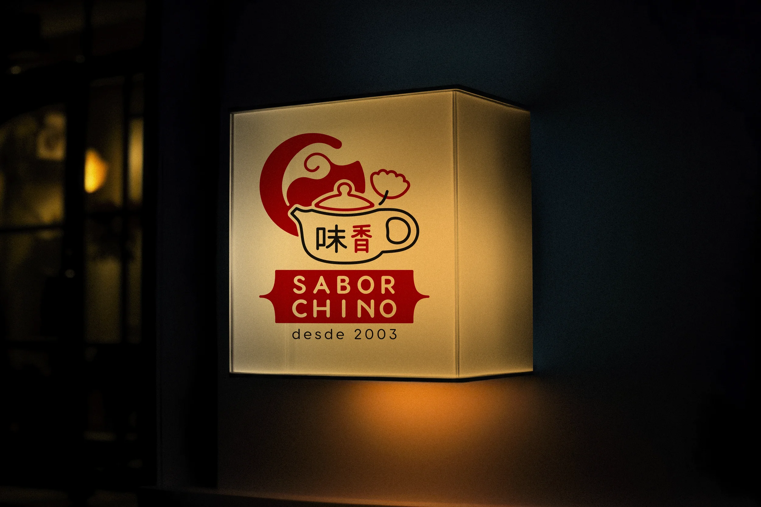
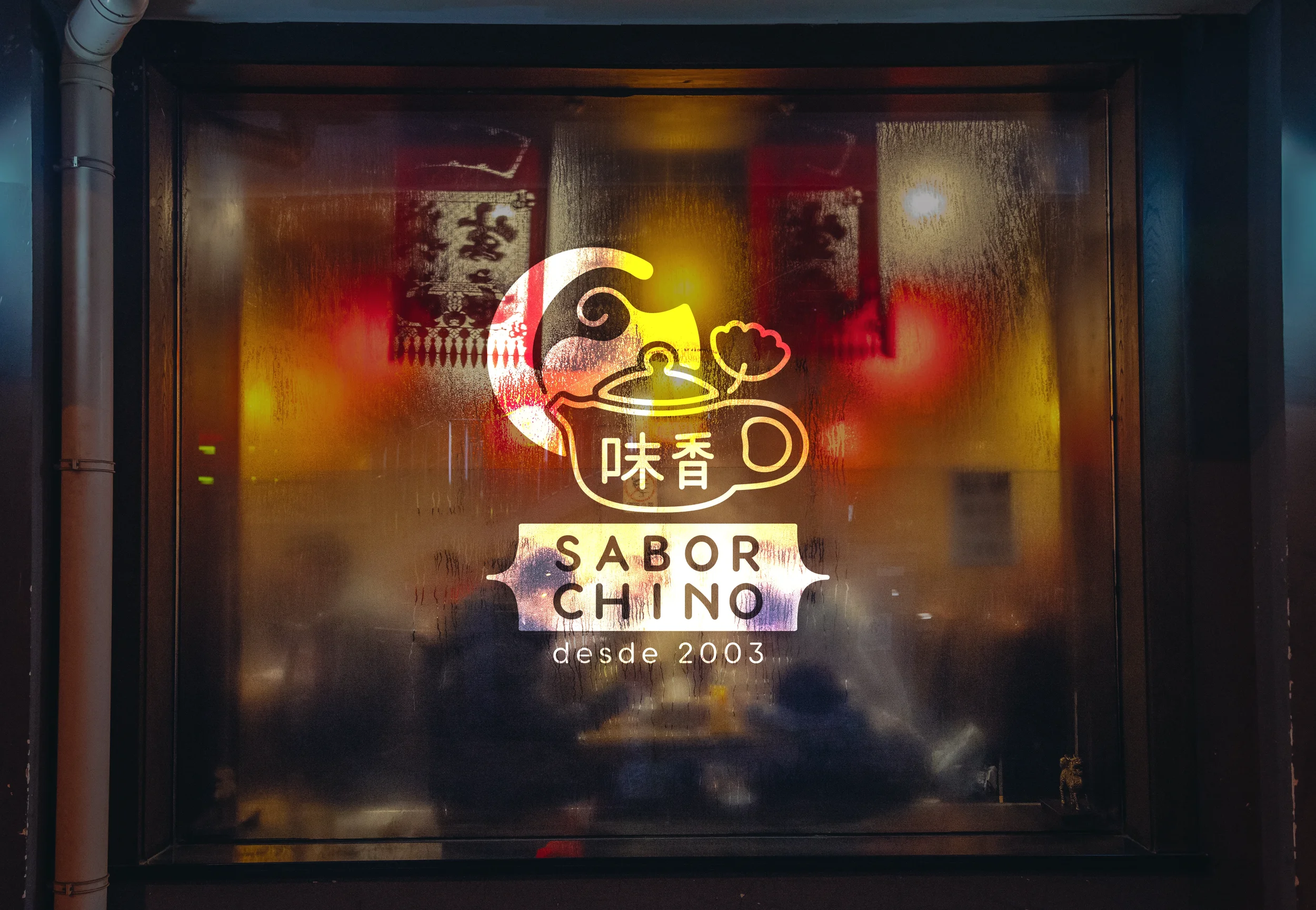
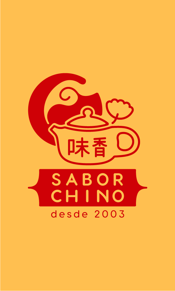
The redesign focused on keeping the iconic teapot while refining its lines into a cleaner, more timeless form. A balance between cultural heritage and a contemporary visual language creates a mark that feels fresh.
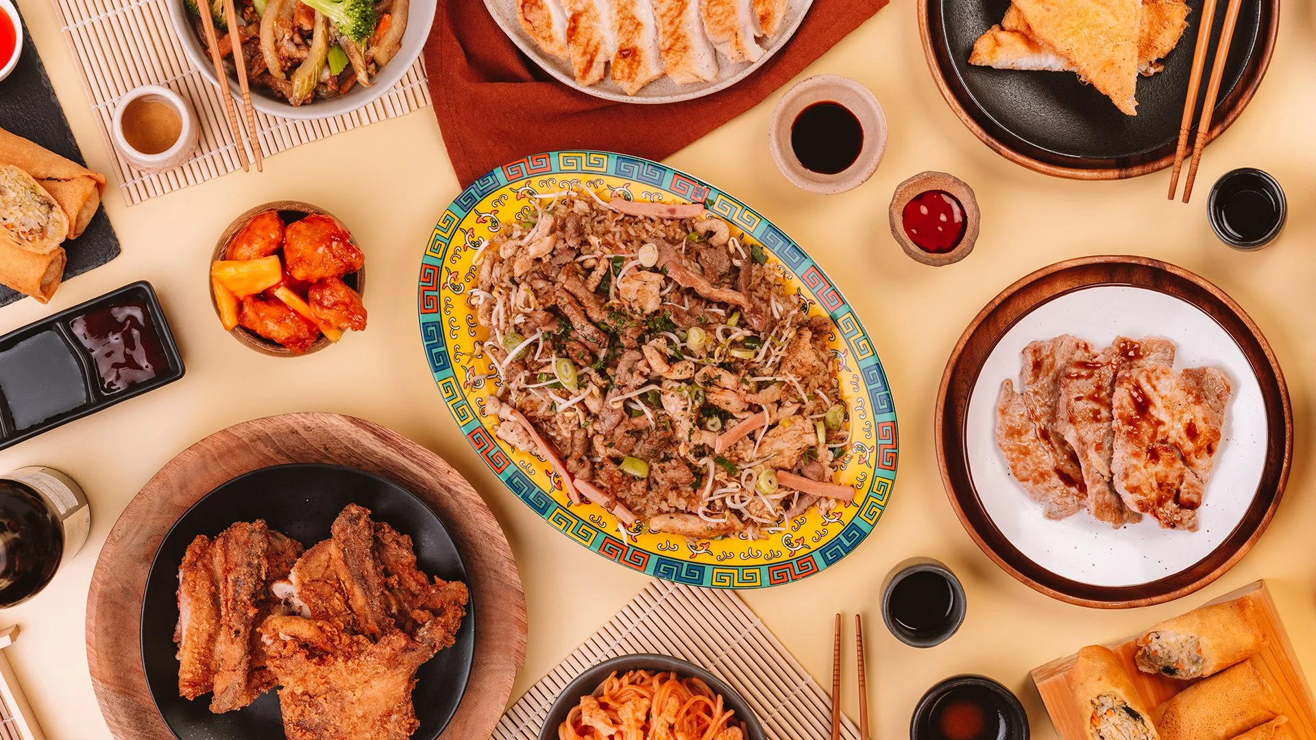
All photos by Juan Camilo Villa
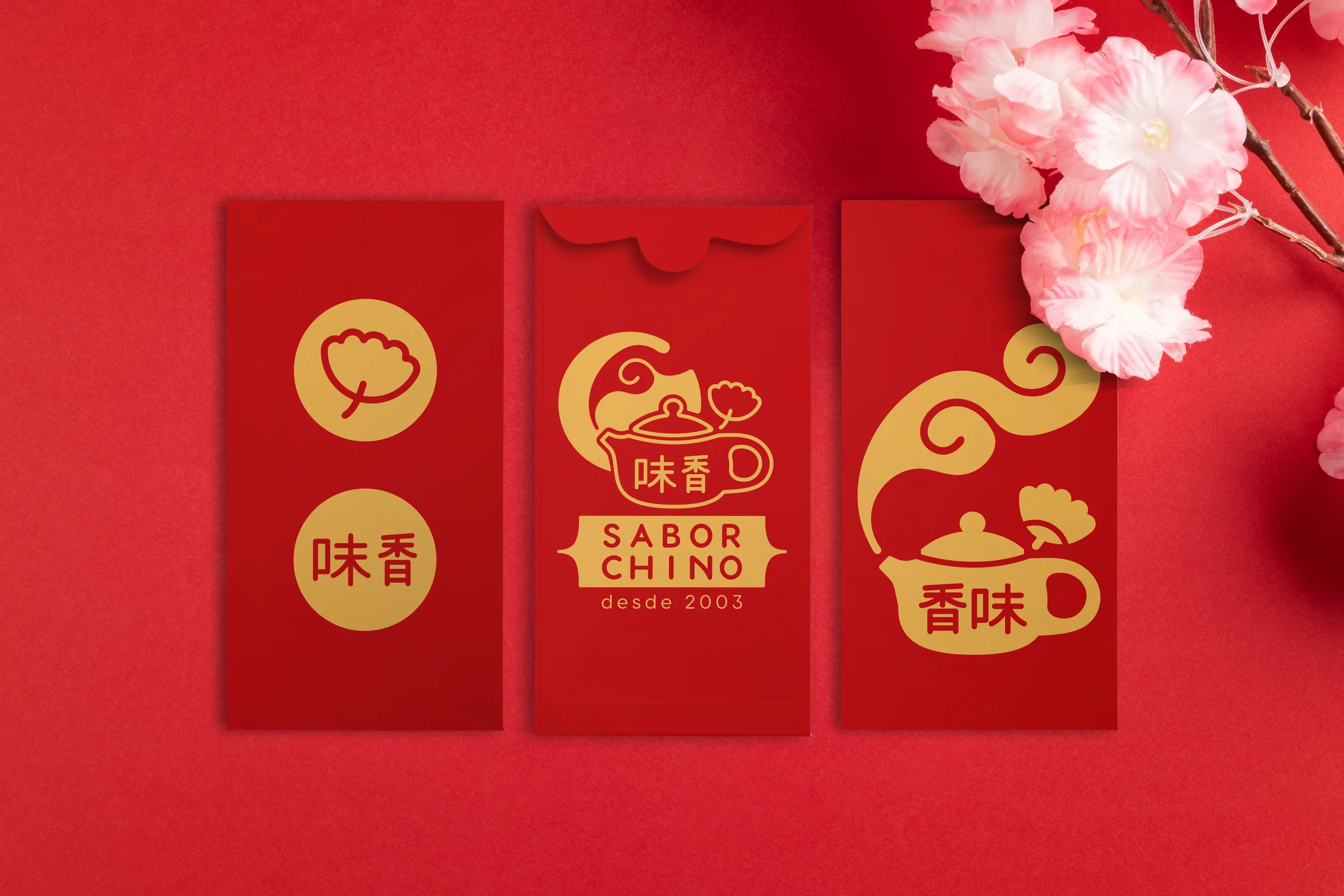
Versatility in every shape.
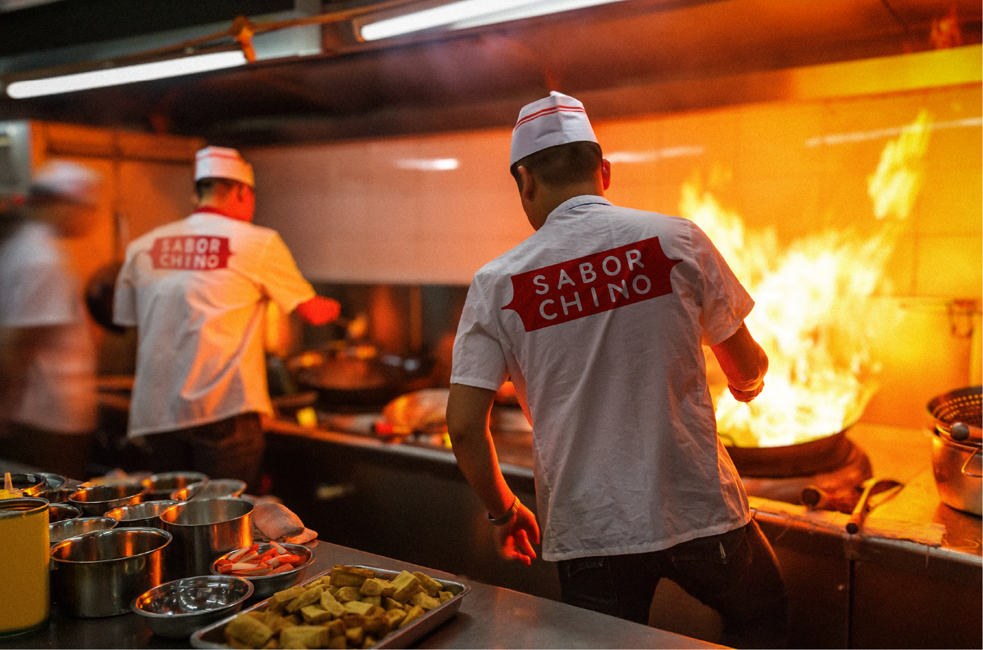

The teapot evolves into multiple abstract forms, each designed for advertising and visual campaigns.




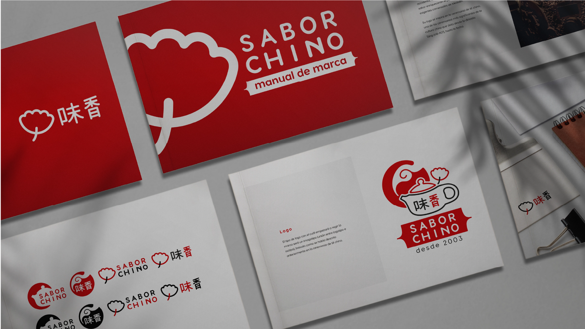
Branding Guidelines
A system built for clarity.
The guidelines define how the logo, typography, and colors work together across every platform. From spacing rules to visual hierarchy, each element ensures el Sabor Chino stays consistent and recognizable in any application.
Web Application
|
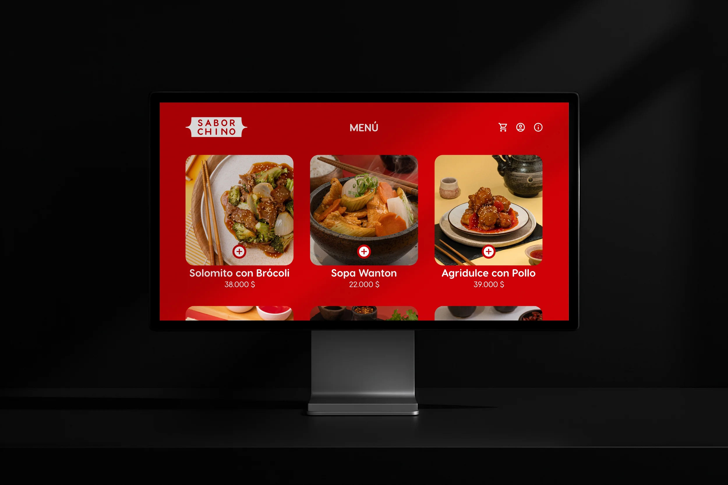
Web Application |

Lightbox Menu
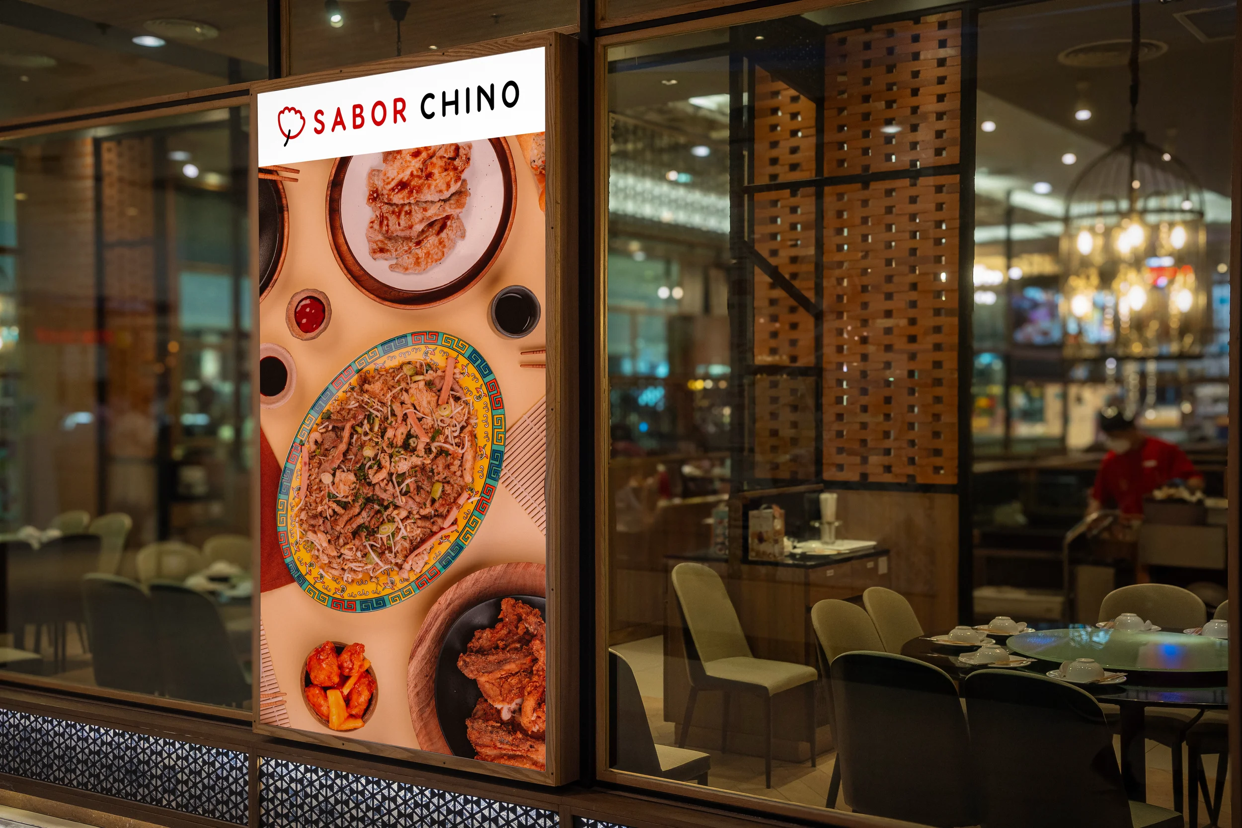
The menu was reimagined as an infographic, simplifying complex options into a clear and engaging visual layout. Icons, color accents, and the teapot symbol guide the customer’s eye while enhancing brand recognition.


